BUILDING A BRAND: REDESIGNING MODE START TO FINISH
Matthew Encina walks through Mode’s 2025 brand refresh: research, positioning, visual identity, website redesign, messaging, and product direction. This StackSlide captures the full end-to-end method so you can replicate it for your own brand.
THE REBRAND MISSION
START-TO-FINISH OVERVIEW
Matthew Encina joins Mode as Chief Design Officer in early 2025. His first mission is a full brand refresh: not just a new logo, but a clearer identity, stronger positioning, and a system that can guide products, website, and marketing for the next five years.
MODE’S ORIGIN STORY
FROM HOBBY TO BRAND
Mode started as Jaicob’s hobby: building a custom mechanical keyboard to chase the perfect typing feel. A first batch of 50 sold with no investors, no crowdfunding, and no certainty. Reinvesting each run, Mode grew into a design-led company focused on elevating everyday work.
WHY CHANGE WHEN IT WORKS?
GROWTH CREATES NEW NEEDS
A growing company still needs change when its beliefs mature. After five years, Mode developed clearer opinions on values, product design, and how it wants to do business. The brand had to catch up to that reality and prepare for new customers, not only existing fans.
WHAT “BRAND” REALLY MEANS
BEYOND LOGOS AND COLORS
A brand is the gut feeling people have about your product, service, or company. Every touchpoint shapes it: product quality, packaging, website flow, customer support, and community presence. Visual identity matters, but it must reflect the deeper promise and experience.
WHAT STRONG BRANDS DO
THE OUTCOMES TO AIM FOR
Strong brands earn reputation and perceived value, stand apart from competitors, and form real connections. That requires examining positioning, product, culture, and customers together, then choosing changes that make the business easier to understand, easier to buy from, and harder to copy.
DISCOVER PHASE
CHAPTER 1DISCOVERY: RESEARCH FIRST
UNDERSTAND BEFORE DESIGNING
Discovery expands understanding before designing: align on goals, study customers, review products, and map the market. Mode analyzed traffic and sales, ran surveys, and did video interviews inside the keyboard community to learn why people buy, hesitate, or pass completely.
PERSONAS + CUSTOMER JOURNEYS
WHO YOU SERVE, HOW THEY BUY
They built personas and journeys to see how different customers discover, evaluate, and purchase. Example: Tim, a UX Design Manager, researches deeply and wants quality plus community. Jay, a busy software engineer, wants fast guidance, simple buying, and ready-to-use options.
BRAND ATTRIBUTE EXERCISES
VALUES, VOICE, FEEL
The team examined the brand through lenses like values, benefits, voice, tone, and look. Brainstorming prompts created word clusters, then themes. These attributes captured what Mode already embodies and what it wants to pursue as it grows: clear, human, crafted, and intentional.
POSITIONING MAP REALITY CHECK
WHERE YOU BLEND IN
They mapped competitive positioning with X and Y axes, plotting competitors and even brands from other industries. The exercise revealed crowded areas where Mode looked similar to others. That clarity forced sharper questions: what must change to own a distinct space in the market?
DEFINE PHASE
CHAPTER 2DEFINE: THE FUTURE VISION
THEMES THAT GUIDE CHOICES
Define turns research into a clear challenge. Patterns emerged into a future vision: Warm Tech (human and inviting), joy in everyday experiences, and making products that deserve to exist. The team also made hard calls, discontinuing products to sharpen focus and quality.
DEFINE: THE DESIGN CHALLENGES
WHAT MUST BE SOLVED NEXT
Define produced specific design challenges: create products that feel crafted, not mass-produced; build a high-end, curated identity that stays humble and human; and design a website that smoothly guides both newcomers and enthusiasts from discovery to purchase.
DEVELOP PHASE
CHAPTER 3STYLESCAPES (MOOD BOARDS, UPGRADED)
FAST EXPLORATION OF DIRECTIONS
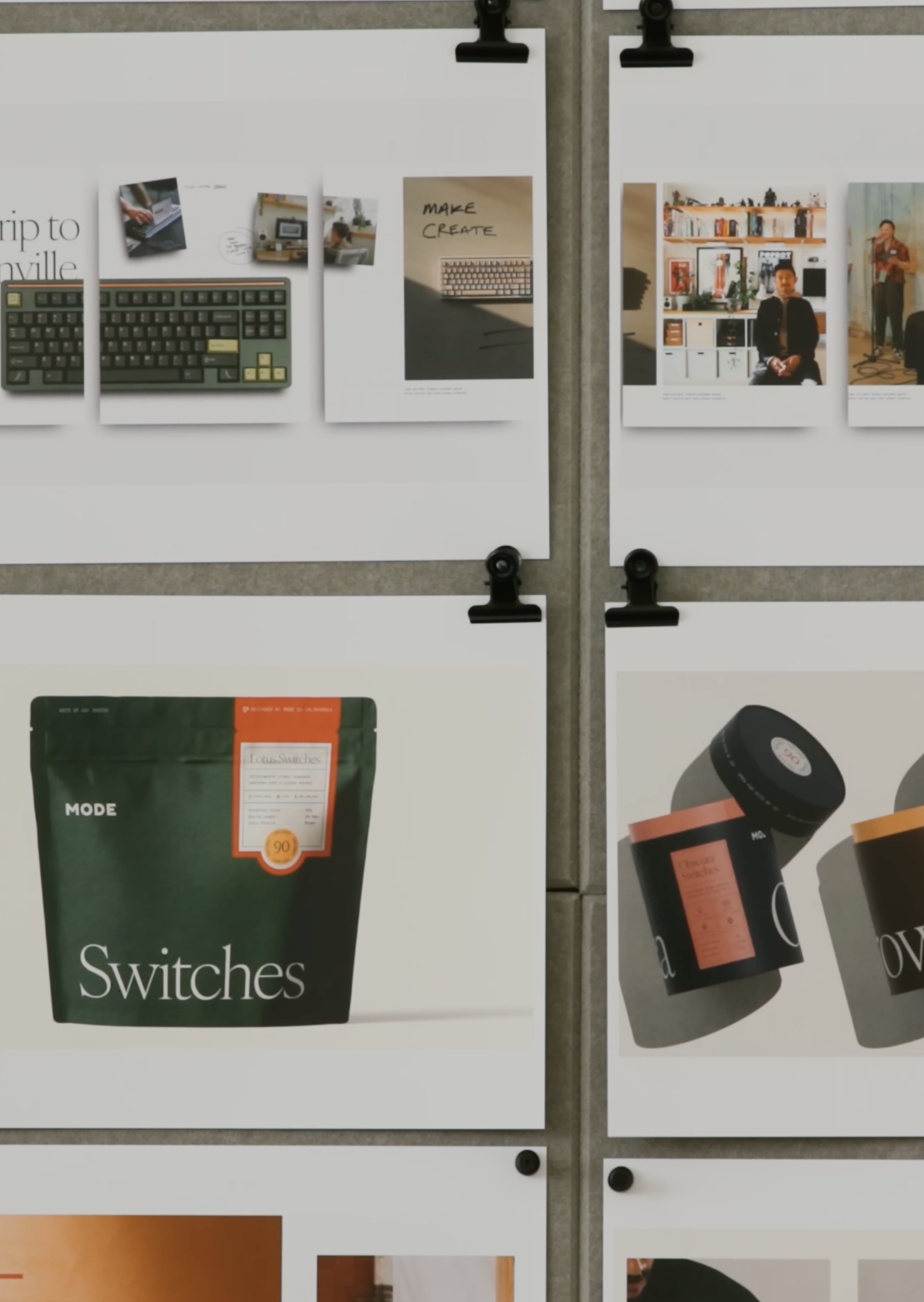
Develop is expansive exploration. They created stylescapes: curated mood boards that translate abstract values into concrete visuals across touchpoints like packaging and screens. Three directions were tested: Serious Fun, Crafted Narrative, and Bits of Joy.
PICK A DIRECTION, THEN MERGE THE BEST
FROM OPTIONS TO ONE SYSTEM
Team feedback selected Crafted Narrative as the core, especially its dark green palette and typography. They also borrowed elements from other directions, like bitmap type and playful illustrations, then merged them into a final stylescape called The Story of Craft.
BUILD THE WEBSITE FIRST
THE BIGGEST BRAND TOUCHPOINT
The final stylescape became the foundation for the complete visual identity. The first major build was the website because it contains the most brand moments: typography, imagery, navigation, product storytelling, and the paths different users take to find what they need.
SITEMAP + KEY PAGES
DESIGN JOURNEYS, NOT SCREENS
Website work started with a sitemap: a bird’s-eye view of every page and the journeys through them. Then they designed key pages with placeholder content to lock the aesthetic and component system. After that, they refined and built the rest over several weeks.
TYPOGRAPHY SYSTEM
WARMTH + CLARITY + TECH CUES
Typography choices supported the story: serif plus sans-serif for warmth and clarity, selective bitmap type as a nod to retro computing and keyboards, and a monospace font for technical copy to highlight engineering. Type was tested in specimens and real page layouts.
COLOR PALETTE DECISIONS
BRAND ACROSS PRINT AND SCREEN
Color selection was treated as a business decision, not decoration. The core became a deep green that feels bold yet calming, linked to nature. Secondary accent colors were chosen to work across packaging, web, and future collateral, requiring multiple review sessions.
PHOTOGRAPHY RULES
CONSISTENCY WITHOUT GUESSING
Photography guidelines made the brand feel real: strong directional lighting, warm natural tones with subtle film grain, lived-in scenes that stay tidy, and people shown without stealing attention from the product. Clear rules let a team shoot consistently over time.
VOICE + MESSAGING SYSTEM
HUMAN, CONFIDENT, CLEAR
Voice and messaging aimed for professional but not corporate, friendly but not fake. Because the keyboard world is full of jargon, they chose simple language anyone can understand. They iterated in a shared document to avoid buzzwords and keep communication honest.
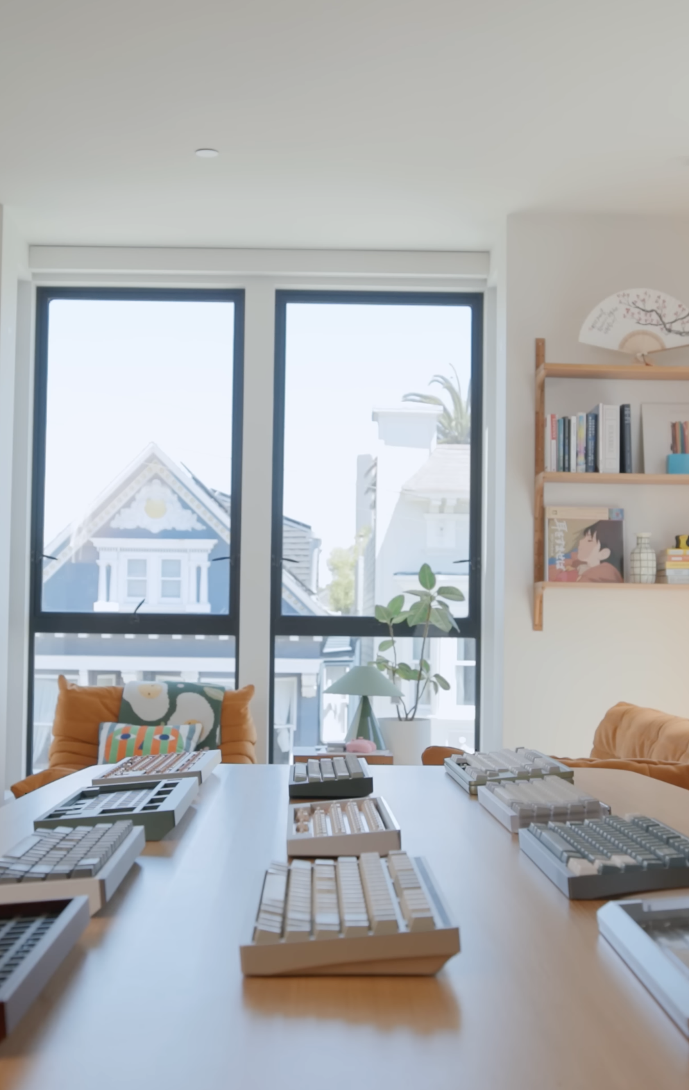
PRODUCT DIRECTION: WARM TECH
THE NORTH STAR FOR DESIGN
The product north star became Warm Tech. Instead of cold, manufactured tech, Mode wanted crafted, human objects. A customer insight reframed the keyboard as furniture that ties a workspace together. That idea guided exploration of forms, materials, finishes, and joy.
DELIVER PHASE
CHAPTER 4DELIVER: THE FINAL 10%
WHERE QUALITY IS DECIDED
Deliver refines the best ideas into a usable system. The last 10% takes the most effort: details, consistency, and cohesion across assets. They iterated early work as they learned more, then planned a rollout that would take months beyond the video timeline.
BRAND GUIDELINES + VISUAL LANGUAGE
MAKE THE SYSTEM REPEATABLE
They finalized brand guidelines: keeping the existing logo to preserve equity, with subtle refinements and detailed usage rules. They built a cohesive visual language across typography, color, imagery, and an “alter-ego” of lo-fi bitmap graphics inspired by retro computing.
MARKETING STRATEGY SHIFT
TRANSPARENCY AND STORY
They established voice rules with messaging samples for website and marketing, plus a guide of brand expressions. Marketing will lean into transparency and story, sharing behind-the-scenes and the people behind the brand to deepen connection and trust.
THE REAL “AHA MOMENT”
HANDS-ON EXPERIENCE CONVERTS
A key insight: many customers connect after experiencing the keyboards firsthand. The “aha moment” happens when they see and type on the product. So Mode plans more in-person creative and tech events to grow community and create stronger, memorable touchpoints.
WEBSITE OUTCOME
DESIGNED FOR BOTH PERSONAS
Results so far: the website redesign is complete and intentionally warmer, with smoother purchase flows for busy buyers like Jay and deeper brand and community content for curious researchers like Tim. Development is rolling out gradually through the year.
PACKAGING + NEXT-GEN PRODUCTS
BRAND MEETS OPERATIONS
Ongoing work includes eco-friendlier packaging, shifting away from foam inserts to recyclable molded pulp. A new studio setup supports consistent photo and video production. Next-gen products are in design, with engineering work underway to strengthen innovation leadership.
KEY LESSONS
CHAPTER 5REBRANDING AS A REPEATABLE METHOD
DISCOVER → DEFINE → DEVELOP → DELIVER
The full process followed the Double Diamond: Discover, Define, Develop, Deliver. The takeaway is that rebranding is business strategy made visible. Research drives decisions, design becomes a system, and every touchpoint must reinforce the same promise: crafted joy and Warm Tech.